
EAFOnline Redesign.
made while interning with Prudential Financial.
time frame: 10 weeks from Jun-Aug 2019
Prudential Financial employees
Angular.js, HTML/SCSS/TypesScript
To redesign and re-code a heavily used web application, EAFOnline.
Every day, millions of data points and new information get entered into Prudential’s databases. To make information easier for the system to process, there is a certain format that must be used when entering data. So whenever files are created with new data, they must first be sent to a server that checks the validity of each file’s format.
EAFOnline is an internal web app that allows employees to monitor the status of files they have sent to this server. And though its user base has thousands of Prudential employees, its UI was underdeveloped—creating many opportunities for improvement.
While interning, I worked with an offshore team in Kiev to rebuild this application, teaching myself Angular.js along the way.
Three Areas of Focus:
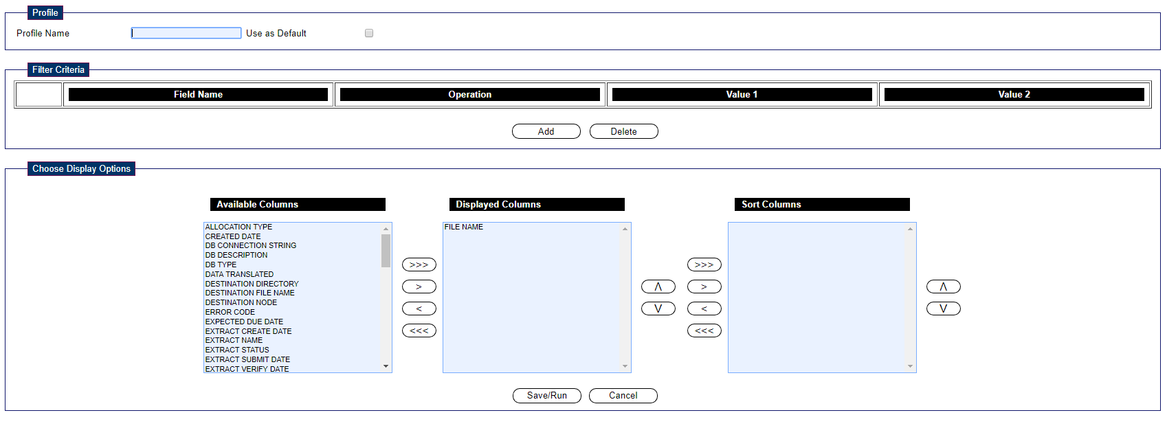
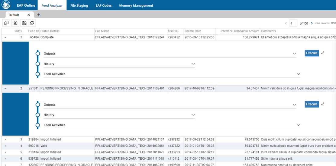
- Home page of feed analyzer: At Prudential, files are referred to as “feeds.” This section is the most important one, as employees view the status of their files here.
- Profiles: A profile is a collection of search conditions and previously had been the main way users searched for files.
- Feed details: Users are also given the option to expand upon each file for further details.
Home Page.
My Role
From the home page, the main elements I worked on were
- Implementing the header based on a pre-existing design, and making it mobile-friendly
- Redesigning the way employees add new profiles and switch between them (more detail on this in section 2)
- Implementing remaining buttons based on an existing design
- For each aspect, I also implemented cross-browser support
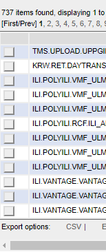
Initial version
how can we improve?
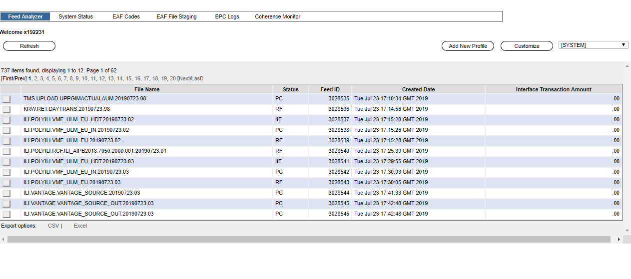
- Header gets lost among other elements. Within a site, the header should give the user a sense of “location” by establishing a clear hierarchy. This header doesn’t stand apart from the other elements.
- Buttons aren't located close to the element they affect. The closer a button is to the element it affects, the more intuitive their relationship is to the user. It isn't immediately noticable here what the refresh, add new profile and customize buttons do because they're far away from their target element.
- The box that displays which profile is in use isn't connected to the current profile. Clicking the box here shows a dropdown menu of profiles we can select from. Since this isn't connected to the profile section, it isn't clear that what's being displayed is the profile in the box.
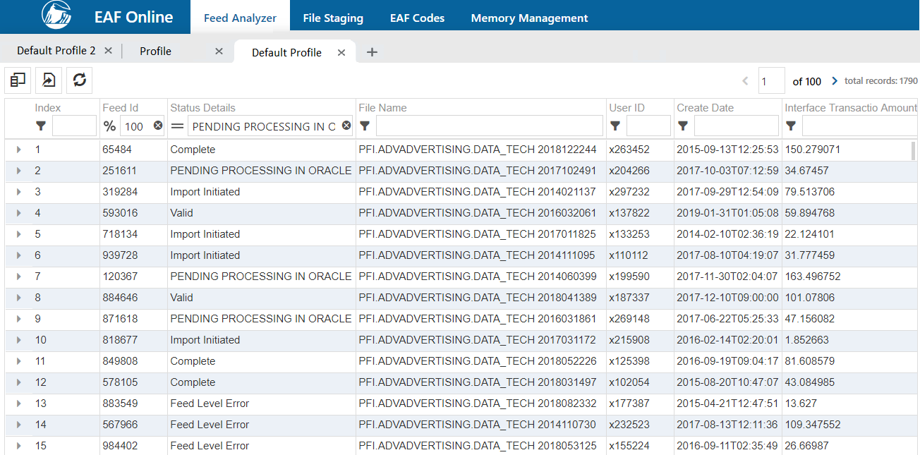
Final version
creating a solution
-
1. Establish a clear header to fill the width of the screen. As well as use color to make it stand out from all other components. To the right is the responsive version.
- Replace buttons with icons and move them closer to the components they impact. The refresh and customize buttons have been turned into icons, and the "create profile" button is now part of a tab structure (more detail later.)
- Clearly show how many different profiles there are as well as what they connect to. Referring to the thumbnail above, we see that instead of a dropdown box, each profile is displayed as a separate tab for ease of navigation.
Profiles.
My Role
- Redesign the way users create new profiles as well as switch between pre-existing ones
- Implement this in Angular and adapt to different browsers
Initial version
how can we improve?
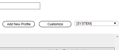
- As mentioned before, the way users switch between profiles is unintuitive. The only way to switch is by clicking the box currently on the "SYSTEM" profile, which isn't immediately noticeable to a brand-new user. If users want to quickly switch between profiles, they will also have to navigate to a remote part of the page each time.
- Every time the user tries to create a new profile, he/she is brought to a completely different screen. Navigating away from the home page each time will disorient the user by breaking user flow. Once taken to that page, the user must also try to find his/her way back--unnecessary difficulty for an action he/she will commonly make. How can we resolve this to allow users to more easily create profiles?
Final version
creating a solution
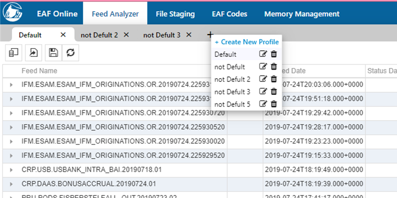
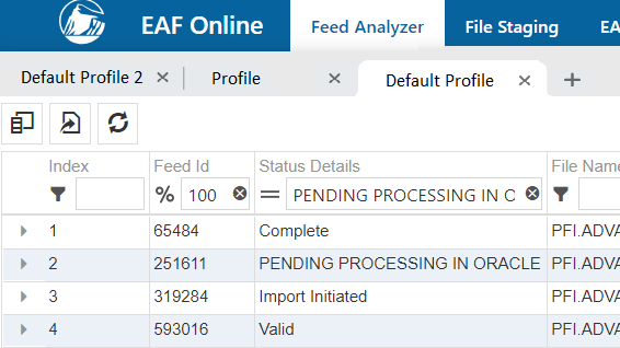
- Implement a tab structure for different profiles. While brainstorming designs, I realized the most intuitive solution would be to display separate profiles like browser tabs—a format users can easily understand. This allows users to switch back and forth more conveniently.
- Keep the "create new profile" popup on the same page. This way, the create new profile function flows naturally from the tab structure design. Just like opening a new browser tab, employees would click the "plus" button to add another profile. From there, they can create a new one or add previously favorited profiles. Clicking on “create new profile” will open a small popup (which isn't shown here since my mentor oversaw that implementation.)
Feed Details.
My Role
Initial version
how can we improve?
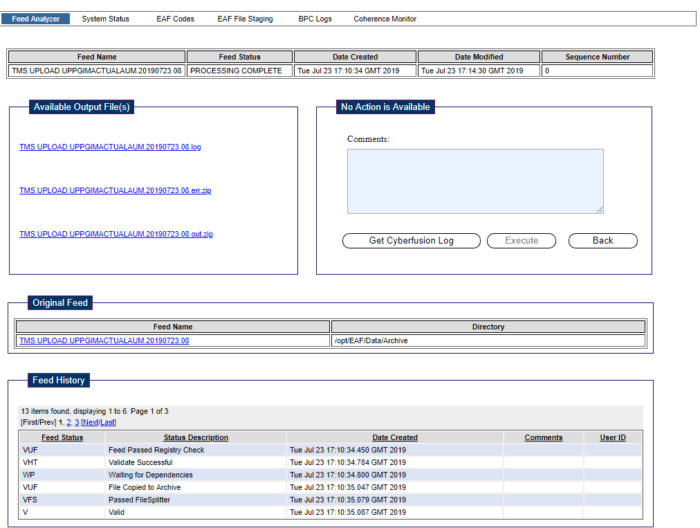
The way users access feed details is unintuitive.
Above is the page users are taken to after checking the gray box next to each file (see screenshot to the right.) Since users are taken to a new page for every detail, there is no way to view multiple details simultaneously. Within the above page, there is also little hierarchy between the original file and its details.
Final version
creating a solution
- Eliminate page reloading so that multiple details can be seen at the same time. To allow users to view multiple details simultaneously, I designed a slide-out menu that appears when the user clicks on a file. Within this menu users can click each section for more information.
- Improve hierarchy to make a clear connection between detail and original file. Since all this information would now be on the same page, it was important to separate the “detail” from the main file. I eventually decided on this design that uses a colorful sidebar to distinguish information. The smaller sidebar within the menu sets up a hierarchy of subdetails.
Reflecting.
As this was my first internship experience, these 10 weeks taught me much about the design/development process. I'm extremely grateful to my mentor and manager for guiding me every step of the way.
What challenges did I face?
- A mentor who worked offshore in Kiev. Though my manager worked on my floor, my mentor was my main source of guidance since she was the official tech lead.
- Using unfamiliar frameworks and languages. EAFOnline's UI was built with Angular.js, a framework I hadn't used before.
- Implementing cross-browser adaptation. Many common SCSS features simply didn't work in Internet Explorer.
How did I overcome them?
- I had to be productive. Since morning video calls were the only way we could communicate, I worked hard in the afternoon so I'd be prepared for the next day.
- Self teaching. YouTube and Google are a CS intern's best friends!
- I got creative. When IE didn't support a feature, I wrote TypeScript functions that would achieve the same effect.
Most importantly, I saw firsthand the importance of empathy in the workplace. User interfaces are living things each individual experiences differently. Though developers are the ones with the technical knowledge, there is still much to be learned from users—and only by listening to each other thoughtfully can we create a more intuitive product.
Today, the rebuilt EAFOnline has officially been released and users are much happier. This was the only the first step on my journey towards becoming a better designer/developer—and I look forward to more.