Pi Network Feature Designs.
time frame: Jun 2021 - Jan 2022
Pi Network Users
React, React Redux, Ruby on Rails, TypeScript
To redesign and rebuild an app with millions of existing users
My first job out of college was at a blockchain startup, where I was given creative freedom as a full-stack developer and the company's first designer. The environment of an early-stage startup taught me how to navigate changing needs while making me a stronger engineer. Here are some highlights of the features I worked on while at Pi Network.
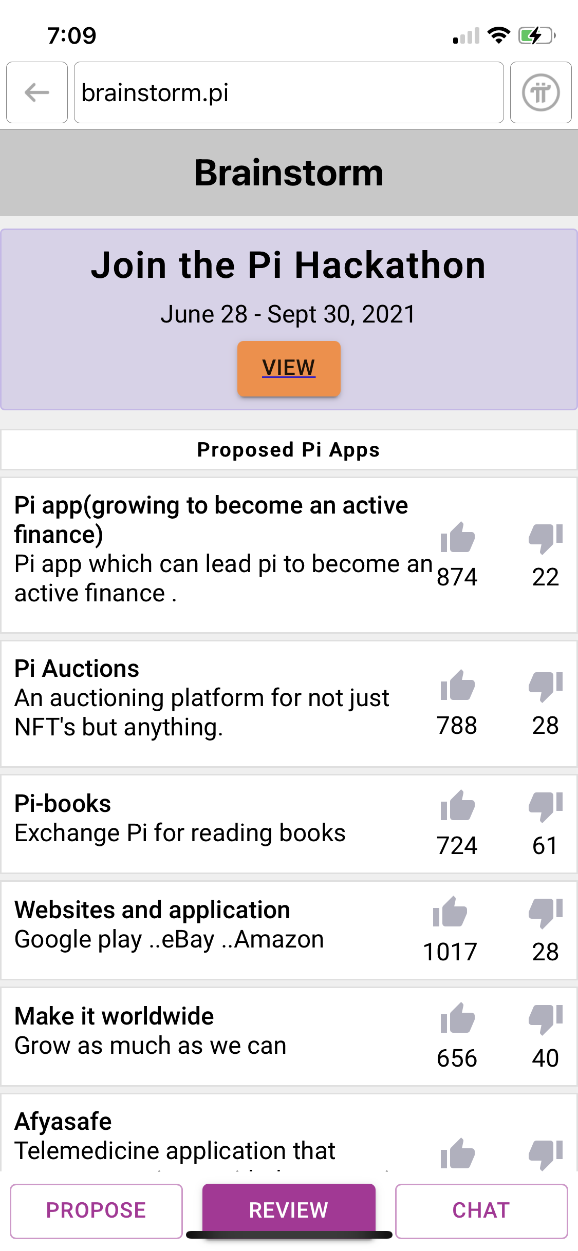
Filter System.
Adding the initial filter system
Adding custom filter tags
After implementing the MVP of the initial filter system, another important feature request was to allow users to search for projects by specialized tags.
Even with a search bar feature, users may not always know exactly what they're looking for until they're prompted with choices. With custom filters, people also have the option to look up projects according to a predefined menu of categories.
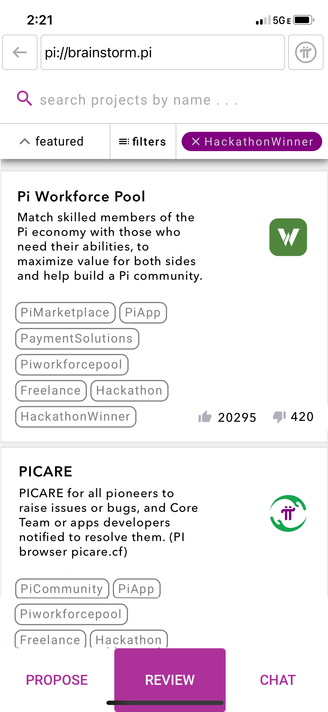
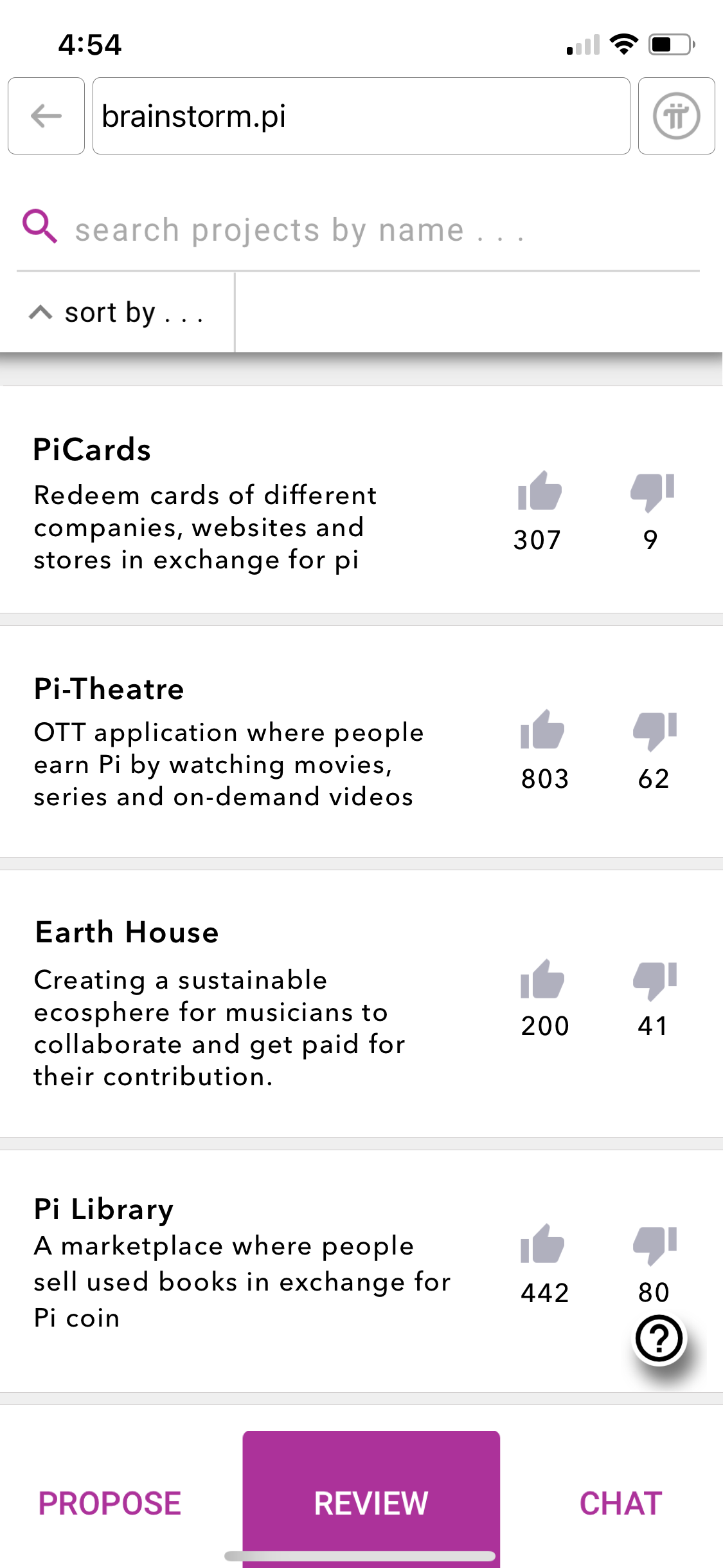
Homescreen after adding custom filters
Here we see the modified homescreen, where the projects have been filtered to show only the featured hackathon winners. There are a few new changes to the UI:
Active custom filters are displayed on the top scroll bar in deep purple. This provides a shortcut for the user to view as well as remove any active filters.
Users may bring up the menu of custom filters by clicking on the filters button.
Within each project blurb, the categories a project falls under are denoted by grey tags. As you see, one project can belong to multiple categories!
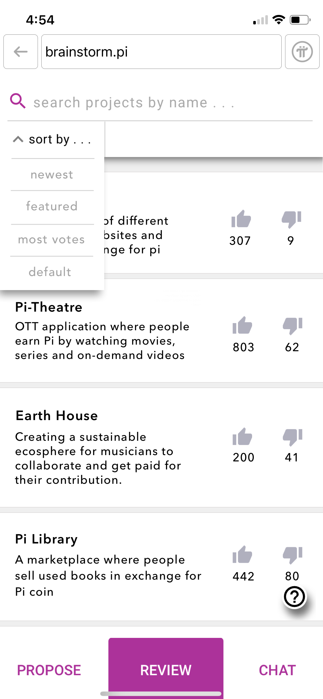
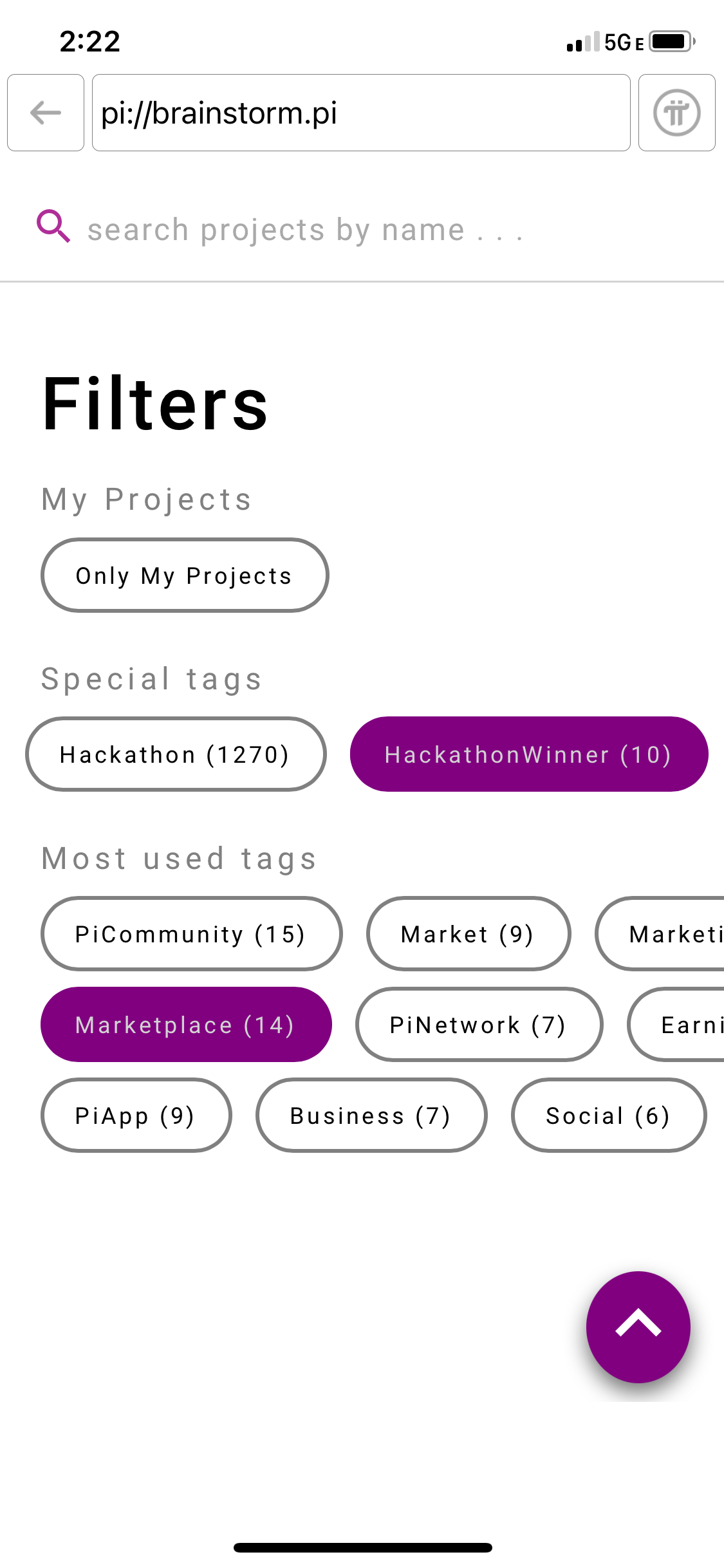
The selection menu for custom filters
The dropdown menu where users can choose which custom filters to apply.
Within the menu, filters are separated into multiple categories. Users scroll horizontally to view the filters in each category.
The Final Result
a. initial version
b. final version
Comparison of how the UI changed from beginning to end. Upon launch day, it felt great to hold the feature I worked on in my own hands.
UI Redesign.
Another project I received was to reimagine the UI of Pi Network's mobile app.
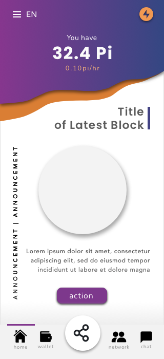
Initial Homescreen
What the mobile app's homescreen looked like when I first joined the company.
The main functionality of the app lies in the energy button and earning circle. By inviting other people to use Pi Network, users can increase the rate at which they mine the cryptocurrency. Users may also tap the energy button once a day to increase their earning rate.
Redesigned Homescreen
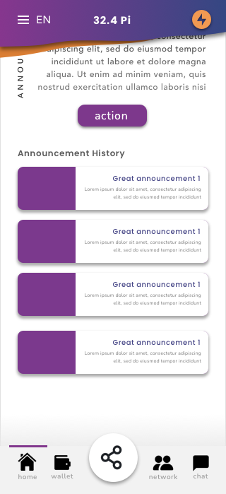
My redesign dedicates a larger area for users to view the amount of Pi they own. I also moved the earning rate to be directly underneath this number as the two figures go hand in hand. As users scroll, this area is meant to collapse in order to save vertical space (see right thumbnail.)
When redesigning the UI, I wanted to create a menu bar at the bottom so that users could more easily access the features of the app. Since this is an app that people use while out and about, it would be inconvenient for them to keep reaching up to the side while holding their phones.
By creating a more streamlined UI, my goal was to establish company credibility and elevate the user experience for people worldwide.
Reflecting.
Working at a startup was quite a valuable learning experience.
Getting to wear so many different hats improved my technical skills and gave me exposure to a wide spectrum of real-world industry knowledge -- all within my first year of graduating college.
Thanks to Pi Network, I've become a more capable engineer, able to quickly adapt to changing needs while voicing my input as a member of a tightly-knit team.